You Need to Stop Relying on your Great Services as your Core Competitive Differentiator
June 1, 2017
Lessons in Language
October 26, 2017Here are some reasons why you may not be getting more leads on your website, and what to change to generate more.
Getting found online by cloud buyers is increasingly challenging in today’s digital global marketplace. Converting leads to buyers is even more difficult. One key contributor to high bounce rates and low online engagement is ineffective messaging. You have 8 seconds or less to grab the buyer’s attention and communicate your value proposition. Of all the websites I have audited, the average bounce rate is 63%. If you are wondering why your investment in SEO and AdWords isn’t paying off, it is because you are losing visitor interest seconds after they hit your homepage. Here are some ideas that will help!
You have 8 seconds to show me a solution that works for me.
Often, when a technology buyer lands on your homepage, the content is all about YOU: what you do, how great you are, how long you’ve been in business, how many awards you have won and customers you have, etc. It doesn’t tell the prospective buyer WHOM your solution is for, WHY they need it, or HOW it will help. The hero of the story is YOU and your products, not the BUYER.
When business problems get painful enough and can’t be ignored any longer, companies will seek a solution. They will look for someone who understands their unique business needs and processes. They aren’t just looking for new cloud technology; they want someone trustworthy to solve their problems.
This article outlines key website “must-dos” to build customers’ trust and show that you understand their pains and have a relevant, specific solution just for them. We call this creating “tribal resonance and engagement.” Here’s how to show prospects YOU should be their top choice.
Include Tribal Artefacts on your website
Contrary to what you may think, do not start listing all your products and services FIRST. This is logical, unemotional information that doesn’t resonate with your prospect and the need to solve a problem. Instead, at the very top of your website, immediately call out whom your solution is for. Let them know they have arrived at the right place. They should immediately recognize themselves and their industry. If you’re a leader in ERP solutions for healthcare, construction, or manufacturing, show images of people in those industries. Display artefacts that confirm you are a member of their tribe – pictures of your customers at work with hard hats! Include photos of your team at tribal events and conferences (think family portrait). All of these artefacts are proof that customers can trust you. What’s the result? More of your prospects will see you as “family” and, in return, will look to you for support. We like to surround ourselves with familiarity, and we feel safer buying from people we trust. Have you ever been in another country and heard someone with the same “accent” and suddenly feel the urge to connect with them in this foreign place?
Your homepage is your first opportunity to establish trust and demonstrate how you have helped other companies. Display all your customer logos and organize them by industry to demonstrate at a glance the types of companies you serve and know. Include customer videos - give problems a voice and show how they got resolved through the words and experiences of peers. This is called “social proof”. In today’s world, I only trust members of my “tribe” and people like me. The law of social reinforcement also states that if we see others have accepted a solution to a problem, then our natural response is to favour the same solution. Prospects will form a warm, positive bias toward your company and will want to learn more about how you can help them, too.
Give me control over my buying journey. Let me choose information I want to consume. Give me a persona-driven journey. Ask me who I am, and then tell me the story in a way that is relevant and specific to me. Here’s a great visual example from Agiles

Are you using Tribal Language that resonates with me?
We all know that feeling of visiting another country and feeling frustrated because we can’t communicate with the locals. Similarly, customers feel alienated when you don’t speak their language on your website. ERP, CRM, IOT, BI, UI, Dynamics 365 – that’s OUR tribe’s language, not theirs. Don’t lead with technology jargon, product information, and a long list of technical features. Talk to me about my problems, hopes, fears, and desires. Tell me how you can solve my problems. By the way, I don’t care WHAT you use to solve them (ERP, CRM, BI, etc.). I just want to know what pains you can help me eliminate or which benefits I can gain. Enough with the features already!
Here are a few more quick tips you can implement today:
Use the second-person point of view throughout your website – YOU
Why? We humans, like all other animals, are inherently selfish – we are only interested in our own survival (and that of our offspring). Meaning, we’re constantly scanning for information that will help us. If your website doesn’t clearly and immediately speak to me, my brain skips this information. Appeal to the “selfish” part of the brain by using the second-person perspective: “Do you want to grow your business?”, “Do you want more leads?”. Instead of talking about “our clients” and “Dynamics 365”, speak directly to your prospects as if they were in the room with you and demonstrate empathy by acknowledging their challenges.
Dedicate more of your messaging to explaining the pains your solution addresses and the benefits of your products
Why? We’re not saying you shouldn’t explain what your product is or does. That is mandatory information your prospective customer is looking for – just don’t LEAD with it. Product features rarely evoke an emotional response and, therefore, do not excite or engage the prospect. Instead, focus on how your product will address your customers’ challenges. This focus will get their brains buzzing and, more importantly, increase your conversion rates.
Gauge and avoid abstract terms
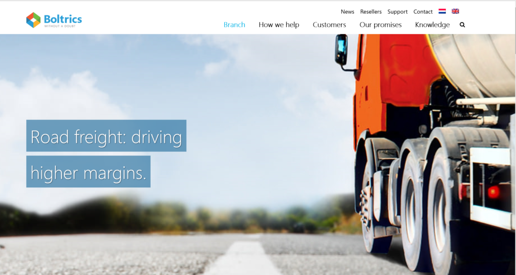
Why? The brain is limited in its capacity to process complex information. Abstract concepts, like “transform your business to the cloud” are vague and irrelevant to your prospect’s business problems. Additionally, most of us are lazy. Don’t make your prospect use valuable mental processing energy to decipher what your product is and if it can help them. Using complicated technical language and acronyms on your website will trigger your customer’s brain to associate “confusing language” with “expensive and risky” and “they don’t understand my business”. On the other hand, familiar and simple language is associated with safety and trust. (The only people your technical language will appeal to is an IT person, and my guess is they aren’t the ones stressing about losing market share, being beaten by competitors, losing customers, or securing a million dollars to solve the problem). By the way, telling me I should “move to cloud” or engage in the “digital transformation” doesn’t translate into more sales or customers. Do the work for me; don’t make me figure it out. Most technology companies include complex, vague, or abstract jargon throughout their websites: “flexible solution”, “integrated approach”, and “scalable architecture”. This kind of jargon doesn’t mean anything to prospects; instead, use simple, precise, and concrete words: “more market share”, “less downtime”, or “more revenue sooner”. Join
Here’s a great visual example from Boltrics

Want more ideas for improvement? Join us this TUESDAY and WEDENESDAY, Oct. 22-23, in Seattle for a two-day intensive marketing workshop to learn how to do all this and more!


